
When I wrote about the orange and black color combination that was popular in the nineteen twenties, I found out that there are still some devoted lovers of orange out there. It turns out that orange and blue were often pictured together in Delineator fashion illustrations in 1924 and 1925.
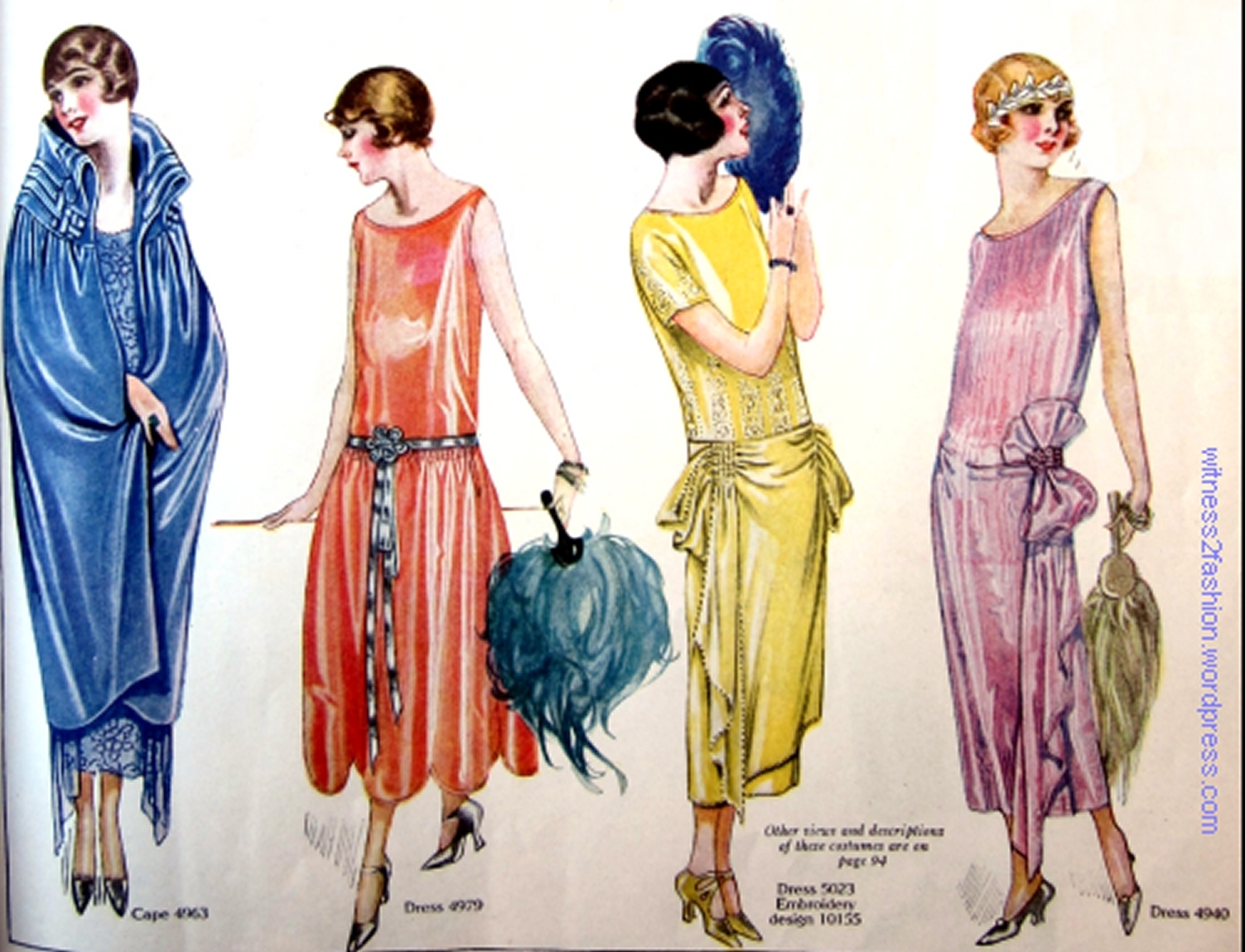
Evening dresses and and evening wrap; Butterick patterns illustrated in Delineator magazine, February 1924.
Of course, orange and blue are complementary colors, opposite each other on the color wheel, and therefore they enhance each other when juxtaposed, — orange seeming brighter and blue seeming more vivid — so illustrators may have put them side by side for this reason.

Butterick patterns 4979 (dress) and 4963 (cape.) February 1924, Delineator.

Butterick dress patterns for July 1924. Delineator magazine.
But orange and blue — in slightly pastel tints — was a frequent combination in garments, especially in clothing for girls.

Butterick patterns 5797 & 5752 for girls for Valentine’s day, 1925. Delineator. [The dress on the right reminds me of quilts from the twenties and thirties.]

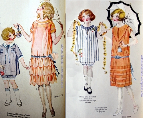
Butterick patterns 4959 and 4995 for girls, February, 1924. Delineator magazine.

Butterick patterns for women 5301 and 5341, July 1924. Delineator. The color on the left is closer to red-orange than to pure red.
Burnt orange or intense orange seems to be more common for “grown-up” dresses.
![Dresses for Misses [age 15 to 20] Butterick patterns 5327, 5329, & 5337. Delineator, July 1924.](https://witness2fashion.files.wordpress.com/2014/11/1924-july-p-29-truer-color-500-misses-5327-5329-5337.jpg)
Dresses for Misses [age 15 to 20], Butterick patterns 5327, 5329, & 5337. Delineator, July 1924.

Butterick patterns for women, August, 1924. Delineator magazine.
Pale orange, peach, or apricot also appear in children’s dresses, often with light blue trim.

Butterick patterns for girls, Nos. 5607, 5543, 5590; November, 1924. Delineator.
Girl’s dress 1925; Girls’ dress patterns for June, 1924. Delineator. #5254 on right.
This little girl is wearing an orange dress smocked with black, with a black coat and orange-trimmed black hat, a combination usually reserved for Hallowe’en now:

Girls’ dress patterns from Butterick, Delineator, March 1924. The blue dress with flower-pot pockets, #5057, is a charming idea. # 5067 is on left.
As Autumn approached, older girls and young women could use intense orange to accessorize either midnight blue or dark green dresses:

Butterick patterns for teens and small women, October, 1924. Delineator. Dress 5489, Coat-dress 5485, and Hat 5561. That orange thing in her hand, far right, is a tiny purse.
That dashing cloche hat is also made from a Butterick pattern.
And, if you weren’t quite prepared for your wedding to include brilliant orange bridesmaids . . .

Bride, Maid of Honor, and Bridesmaids. Butterick Pattern illustration from Delineator magazine, October 1924.
this blue and pastel red-orange bridal party might be just what you want:

Bride and bridesmaids, April 1924. Butterick patterns 5137, 5158, 5093, 4462. Delineator magazine.
The dresses on the right have a muted coral bodice and tiers of coral taffeta softened with white lace overlays, with rose pink hats and trim. [The pinkish color may be a result of layering white organza over the bodice fabric.]

Bride’s attendants, April, 1924. Delineator magazine.
The bride’s home could even have an orange and blue kitchen:

An ad for Hoosier cabinets, Delineator magazine, Oct. 1925.
This post is dedicated to Lynn and Brooke, who wrote to say that they love orange.
